Plotting optimization progress, surrogate surfaces, and contour plots.
spotoptim provides plotting utilities for inspecting optimization runs. You can visualize the convergence history, the fitted surrogate surface, contour maps of any callable, and the distribution of evaluated design points. All plot functions live under spotoptim.plot.
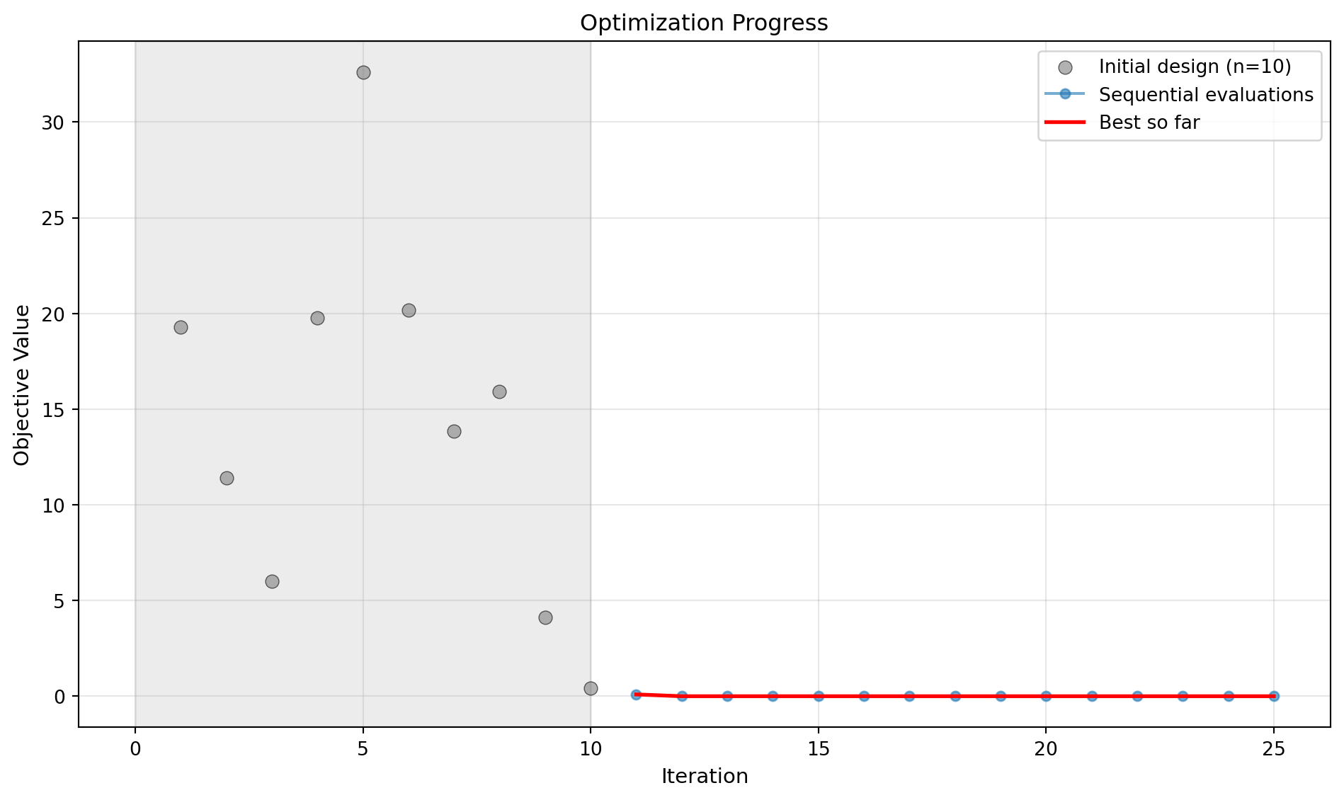
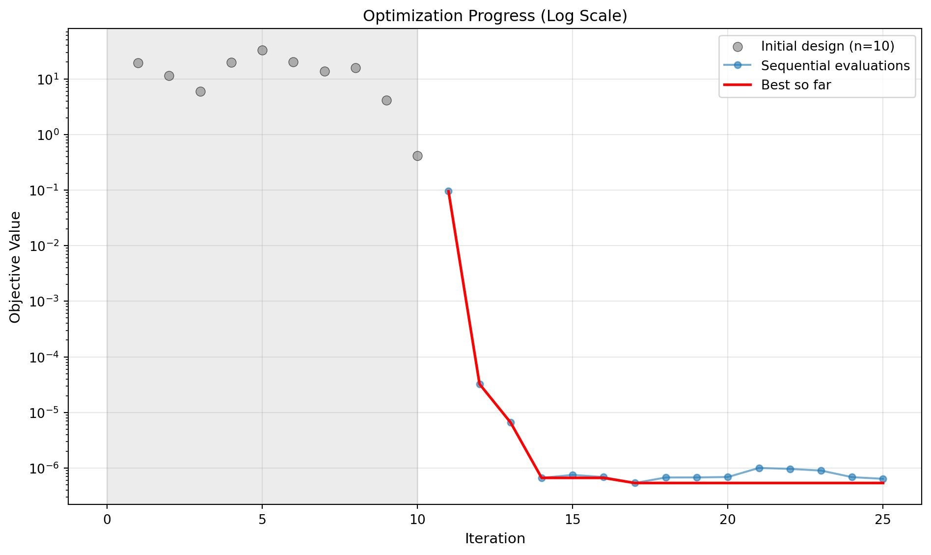
Optimization Progress
plot_progress displays the full evaluation history as a scatter/line chart with a best-so-far curve overlaid in red. Initial design points appear as grey dots with a shaded background region; sequential evaluations are connected by a line.
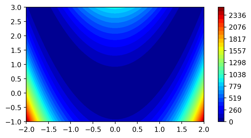
simple_contour draws a quick 2D filled contour of any callable over a rectangular region. The function must accept a (1, 2) array and return a scalar (or 1-element array).
import matplotlib.pyplot as pltimport numpy as npfrom spotoptim.function import rosenbrockfrom spotoptim.plot.contour import simple_contoursimple_contour( fun=rosenbrock, min_x=-2, max_x=2, min_y=-1, max_y=3, n_levels=30,)plt.show()
Parameters:
Parameter
Default
Description
min_x, max_x
\(-1\), \(1\)
Range for the first axis
min_y, max_y
\(-1\), \(1\)
Range for the second axis
n_samples
100
Grid resolution per axis
n_levels
30
Number of contour levels
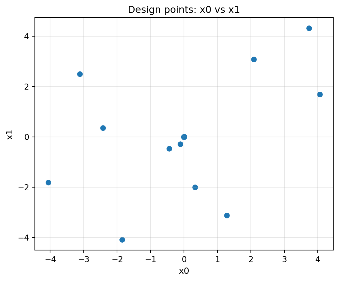
Design Points
plot_design_points creates a scatter plot of evaluated points projected onto two dimensions. When the problem has more than two dimensions, the remaining dimensions are aggregated (default: mean) and used to colour the markers, giving a visual cue about hidden-dimension spread.