plot.visualization.plot_progress

plot.visualization.plot_progress(
    optimizer,
    show=True,
    log_y=False,
    figsize=(10, 6),
    ylabel='Objective Value',
    mo=False,
)

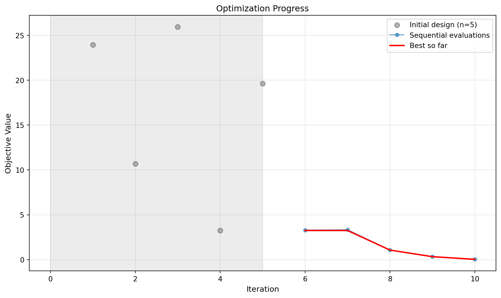
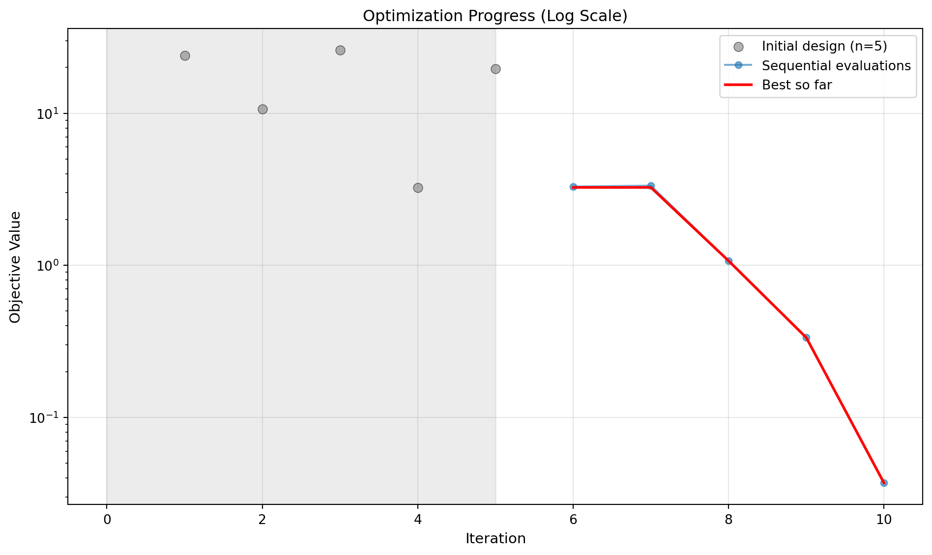
Plot optimization progress showing all evaluations and best-so-far curve.

This method visualizes the optimization history, displaying both individual function evaluations and the cumulative best value found. Initial design points are shown as individual scatter points with a light grey background region, while sequential optimization iterations are connected with lines.

Parameters

Name Type Description Default
optimizer SpotOptimProtocol SpotOptim instance containing optimization data. required
show bool Whether to display the plot. Defaults to True. True
log_y bool Whether to use log scale for y-axis. Defaults to False. False
figsize tuple Figure size as (width, height). Defaults to (10, 6). (10, 6)
ylabel str Label for y-axis. Defaults to “Objective Value”. 'Objective Value'
mo bool Whether to plot individual objectives if available. Defaults to False. False

Raises

Name Type Description
ValueError If optimization hasn’t been run yet.
ImportError If matplotlib is not installed.

Examples

import numpy as np
from spotoptim import SpotOptim
from spotoptim.plot.visualization import plot_progress
from spotoptim.function import sphere
opt = SpotOptim(fun=sphere, bounds=[(-5, 5)]*2,
                max_iter=10, n_initial=5, seed=42)
result = opt.optimize()
# Plot optimization progress (linear scale)
plot_progress(opt, log_y=False, show=False)
# Plot with log scale
plot_progress(opt, log_y=True, show=False)