Exploratory Data Analysis

Histograms, boxplots, and summary visualizations for optimization data.

The eda subpackage provides quick visualization functions for exploring optimization data. These are particularly useful for inspecting the distribution of evaluated parameter values and objective function responses.
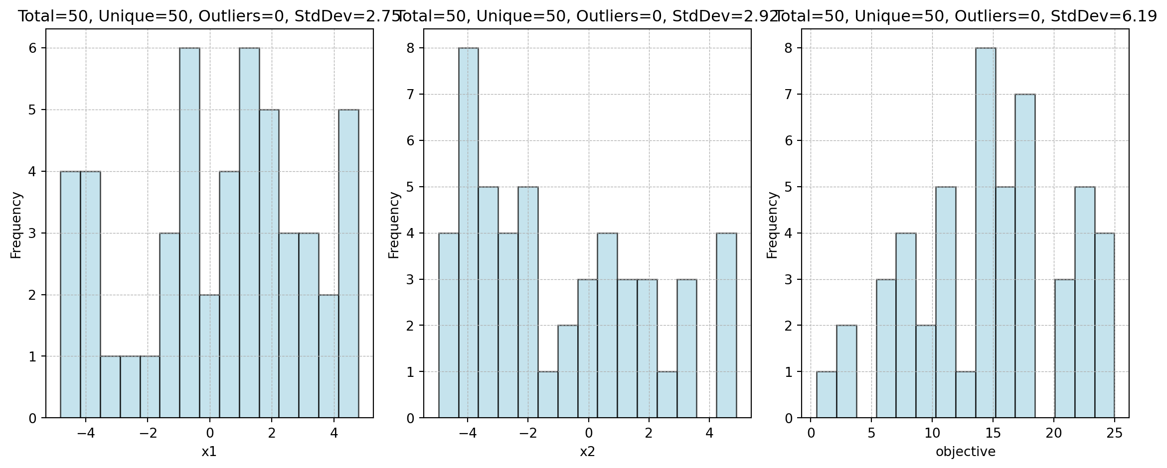
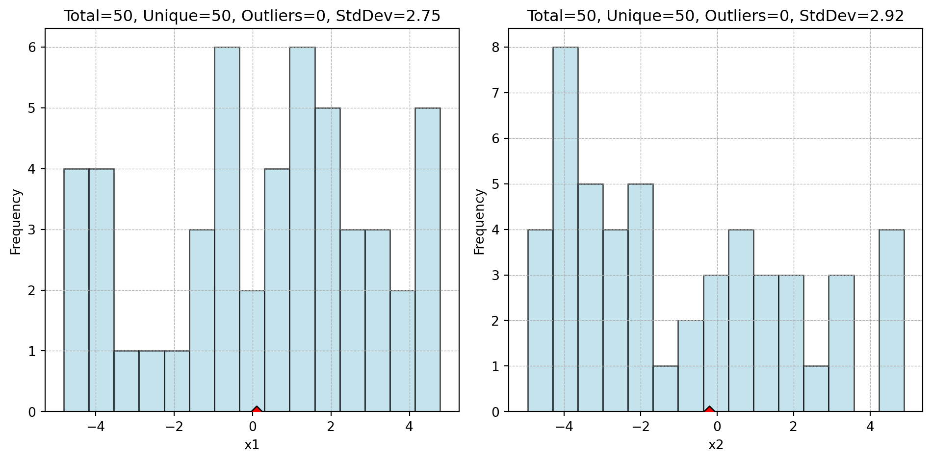

Histograms

plot_ip_histograms() creates a grid of histograms for each column in a DataFrame. Columns with few unique values (controlled by thrs_unique) are shown as bar charts instead.

import numpy as np
import pandas as pd
from spotoptim.eda.plots import plot_ip_histograms

np.random.seed(0)
df = pd.DataFrame({
    "x1": np.random.uniform(-5, 5, 50),
    "x2": np.random.uniform(-5, 5, 50),
    "objective": np.random.uniform(0, 25, 50),
})

plot_ip_histograms(df, bins=15, num_cols=3, figwidth=12)

Highlighting Specific Points

Pass add_points to overlay vertical lines for specific configurations (e.g., the best solution found):

import numpy as np
import pandas as pd
from spotoptim.eda.plots import plot_ip_histograms

np.random.seed(0)
df = pd.DataFrame({
    "x1": np.random.uniform(-5, 5, 50),
    "x2": np.random.uniform(-5, 5, 50),
})

best_point = pd.DataFrame({"x1": [0.1], "x2": [-0.2]})
plot_ip_histograms(df, bins=15, num_cols=2, add_points=best_point)


See Also