Cross-entry comparison plots for forecasting campaigns / leaderboards.
Generalises the rank-stability bump chart and the critical-difference diagram of a manuscript’s results section into a reusable, stateless API. Both functions return a matplotlib.figure.Figure; the caller is responsible for saving and closing it. Neither function calls plt.show() nor mutates matplotlib.rcParams — styling and figure lifecycle stay with the caller (set matplotlib.use("Agg") before importing pyplot in headless environments).
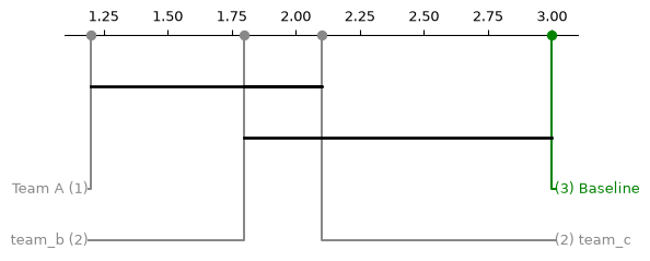
Critical-difference diagram (Demsar layout) over paired entries.
Thin wrapper over scikit_posthocs.critical_difference_diagram. scikit_posthocs pulls in seaborn at import time, so it is imported lazily inside this function rather than at module scope (the same precedent as plots.diagnostics.plot_shap_summary for shap).
Mapping of entry id to display name. When given, both positions and sig_matrix are renamed before plotting, and color_palette keys (which refer to the original ids) are renamed to match.
Mapping of entry id (original id, renamed automatically when labels is given) to a color for that entry’s marker and label. scikit_posthocs requires a color for every entry in positions once a palette is given.
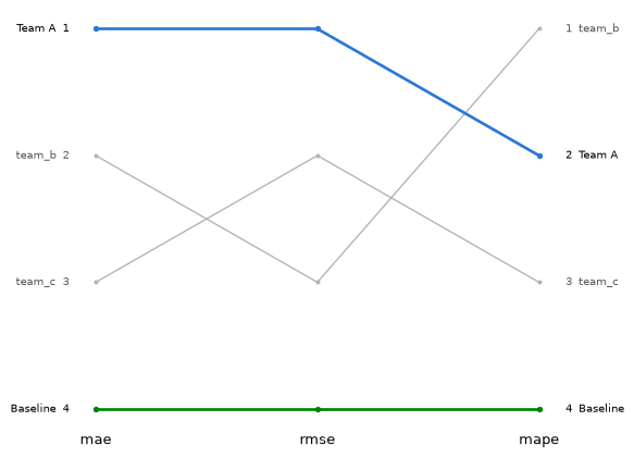
Bump chart of entry ranks across a set of metrics.
ranks has one row per entry (the index holds the entry id) and one column per metric, in the order the metrics should appear on the x axis. Cell values are the entry’s integer rank under that metric. A line connects each entry’s rank across the metrics; entries listed in highlight are drawn with a thicker line, a larger marker, and their given color, while every other entry shares base_color.
When True, write "label rank" to the left of the first column and "rank label" to the right of the last column for every entry. The labels are drawn with clip_on=False, so they render outside the axes box — widen the figure margins (e.g. via fig.subplots_adjust) to make room for them.